Water For People

Perry is one of the best designers I've ever worked with. Not only because he is efficient, innovative, and constantly working to improve every project, but because he genuinely cares about his clients and the work they're doing. While working with him at Water For People, Perry took the time to not only teach me how things were done but explain the reasoning behind every edit. He took the time to get to know our brand and you could tell by the amazing product he produced, for him it isn't just another website, it is a form of storytelling.

Maranda Bodas, Water For People
HomeHomeMapHistory

Goal

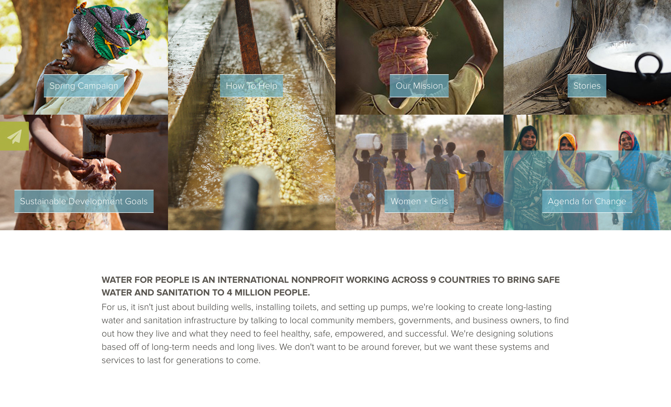
To raise awareness of the water crisis and what makes Water For People different from its competitors.


Approach

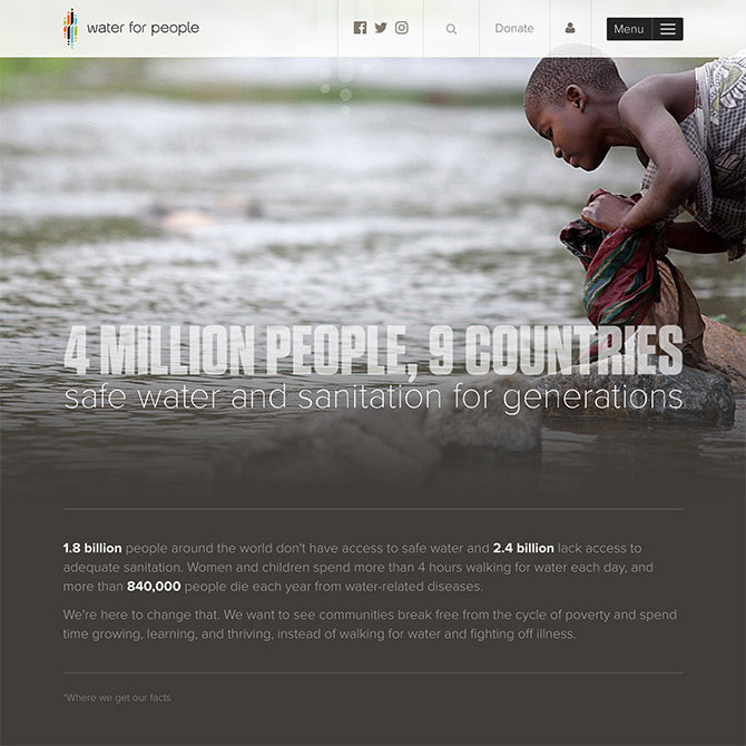
  • Define the problem with hard numbers (works better than emotion alone) and back those numbers up with citations from reputable sources (like the WHO).
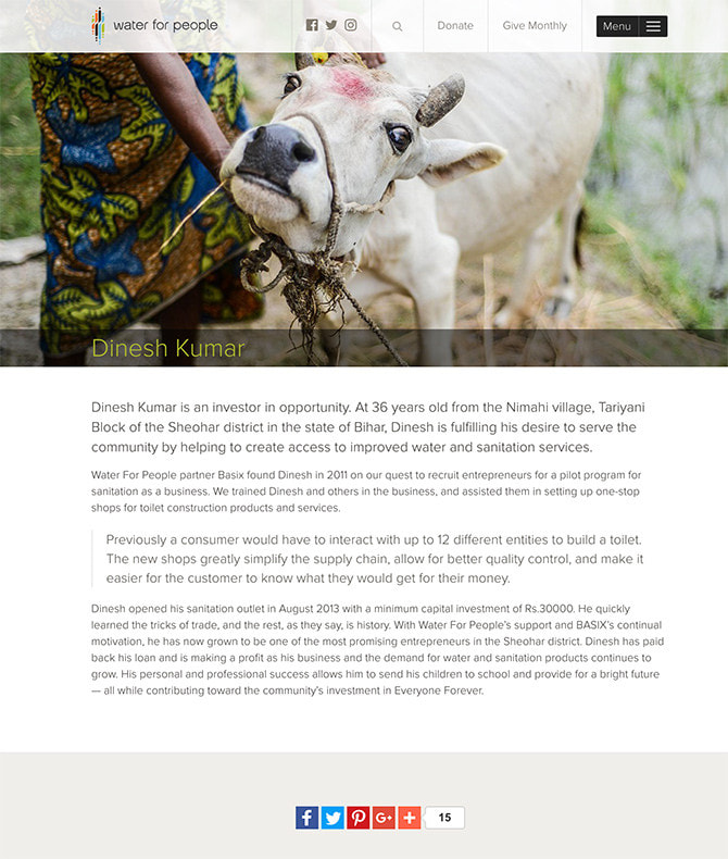
  • Illustrate what Water For People does differently (they don't just build wells).
  • Focus on a few key news items that need to be front and center.
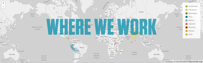
  • A fully-functional map that can zoom in on the various districts where Water For People works. It not only shows you the geography, but you see the districts where Water For People works and see stories associated with that district.
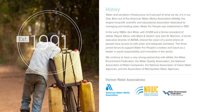
  • Emphasize the history: Water For People has a deep (pun intended) history in the global water community. While it's great to see actors supporting a cause, Water For People was founded by engineers who had actual real-life understanding of the problem because they had been there in a work function.
DonateDonor Login

Goal

Solicit donations without being heavy-handed.


Approach

  • Even if you're a non-profit and your continued existence relies on donations, you have to be careful about how you ask. As important (vital) as it is, I've kept it subtle; however, you'll notice that donate is in the upper right of every page and the only part of the site's navigation (other than icons), that is not inside the main nav.
  • Keep it simple: An overwhelming amount of research shows that the shorter the form, the higher the conversion. A non-profit does not have the luxury of eliminating some fields (like the address field), but I paired it down to the bare minimum.
  • The total you enter in the input box is reiterated in the actual button to finalize your donation to further transparency and ease of use.
  • Most non-profits strongly encourage monthly-giving, it's the best they can hope for to have users so committed to the cause they'll give a small bit every month. However, if you can't manage that donation, it creates uncertainty and may prohibit people from giving. I wanted to show your complete purchase history as well as let you edit your information.
StoriesStoryAbout

Goal

Allow the client to manage content.


Approach

  • I don't believe in traditional Content Management Systems (like Wordpress and Drupal). They end up as insecure, templated websites where the content has no relationship to the presentation. I believe that design is (in part) a marriage of content and presentation, you can't just toss in an arbitrary photo and unknown amount of content and expect to have a huge impact. Furthermore, if you ever want to change technologies (e.g. from PHP to Ruby or Ruby to Node), you're in for some suffering.
  • What I do believe in is a headless CMS — a language agnostic, cloud-based tool that allows you to flow content into anything, iOS, Android, websites, web apps, potentially even print (soon). This allows me as the designer to finely define what content we're looking for and give it spaces to go. I can limit it by size and leave notes for the content editor to remind them of the goals of that section.
  • A lot of a website doesn't change very often — this stuff is hard coded. But some stuff changes often. This site is backed by Contentful. The Water For People staff can add employees, stories (with several templates), news, supporter logos, careers, etc.
  • Contentful Writeup
NavigationNavigation

Goal

Make it easy to explore the site.


Approach

  • On most sites, mobile visits account for over 50% of the traffic. That's changed the way websites look and behave, but the navigation on many sites hasn't evolved along with the rest of the site. Waterforpeople.org has a massive amount of content, and besides a search bar that's on every page, I made the navigation just as inviting and easy-to-use as the rest of the site. You can get to almost anywhere from one expanded navigation that takes over the entire page, it's also designed (vs just a list), this allows me to weight certain areas more than others (e.g. Donate and Stories).
  • In addition to a super-functional navigation, the site uses Google Search with a global search bar on every page.
  • Lastly, navigation tends to take up a lot of real estate, especially on mobile devices. The entire nav bar scrolls away with the content, but as soon you as you start scrolling back up to the top, the nav comes back, no matter where you are in the page. This makes the nav twice as useful and always a moment or two away.