Taddiken Tree

The redesign for taddikentree.com came at the perfect time for me. It was freelance project that provided a nice break from corporate design work (Amazon) and Taddiken was a company I really believed in.

Taddiken was the perfect customer. Most of the time they let me have free rein and do some really crazy things—but at the same time, they weren't afraid to push back when they didn't like something. Most of all though, I know they trusted me and respected my craft, so it gave me the ability to really have fun and do work I am proud of.

Homeblogad

Goal

2023 redesign of the site (killed in progress).


Background

Taddiken Tree was a locally-owned company for over 20 years. Not many places can claim that. In 2023, they were absorbed by a larger tree company and I stopped working with them. Hence all the past tense. That's part of why this redesign never went live.


Approach

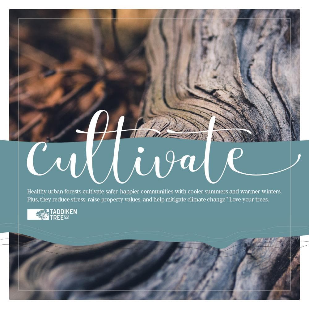
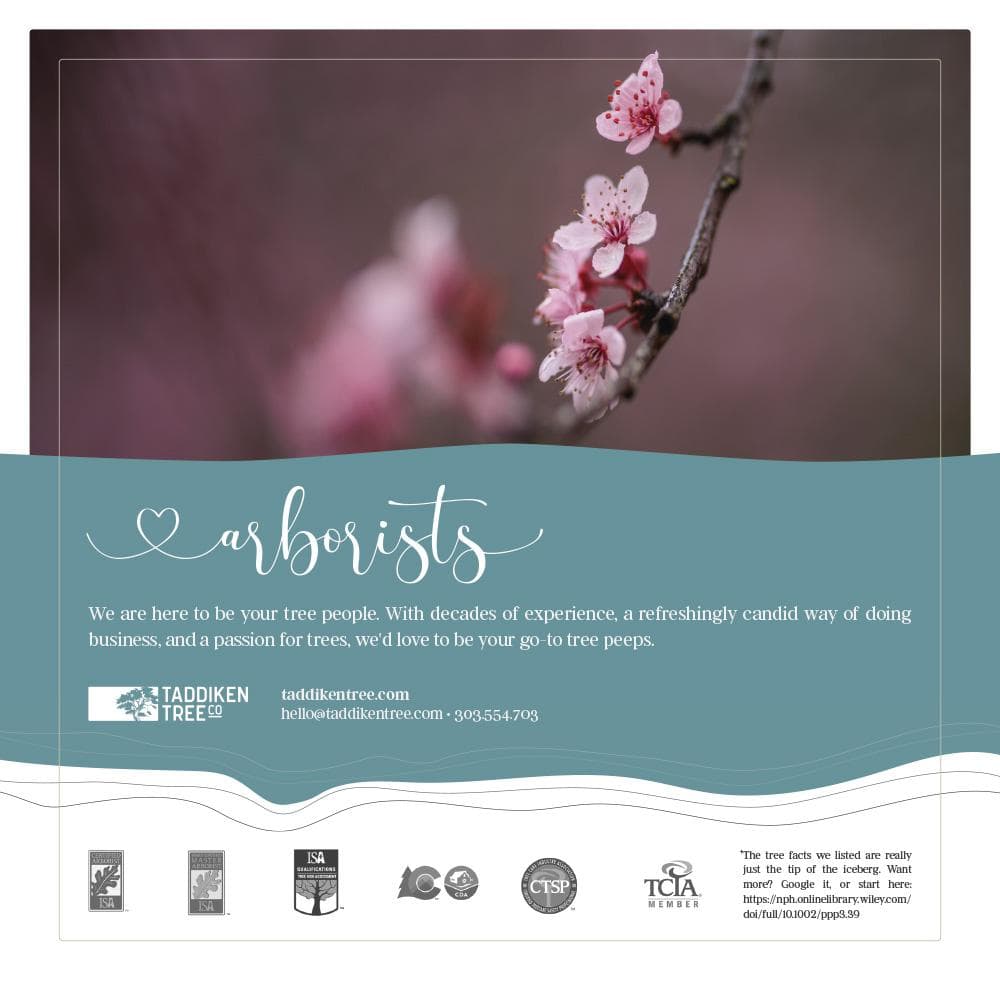
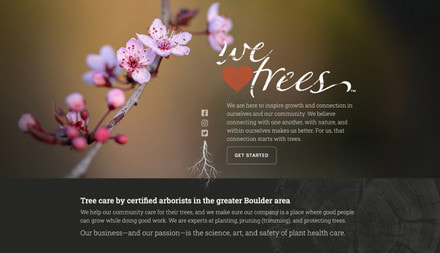
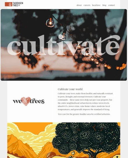
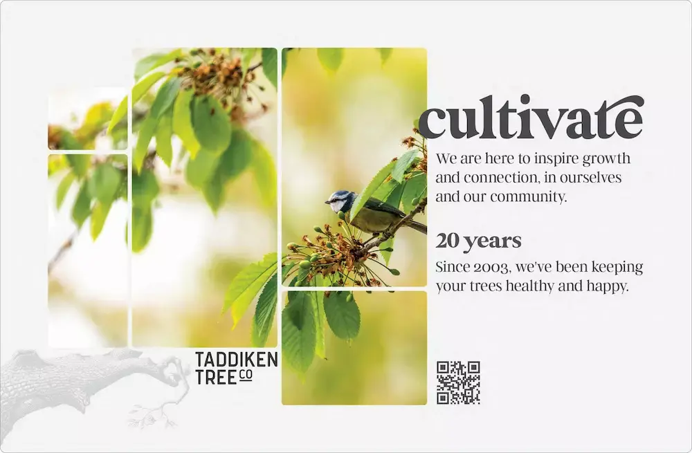
I like full bleed images on websites, but on desktop views, they can pose problems. One of the fun things we did on their site was to change it up with the seasons. When autumn rolled around, we'd change the hero to autumn, and when winter came, we'd have snow fall over the hero (well, CSS and JS snow), those sort of changes. As the years progressed, it got harder and harder to find images that would work well as a full bleed in extreme crops. So this new approach allows for a more diverse group of images, it worked better on mobile, and the image could vary in height quite a bit. The big "cultivate" could also change and tied in with ongoing marketing efforts.

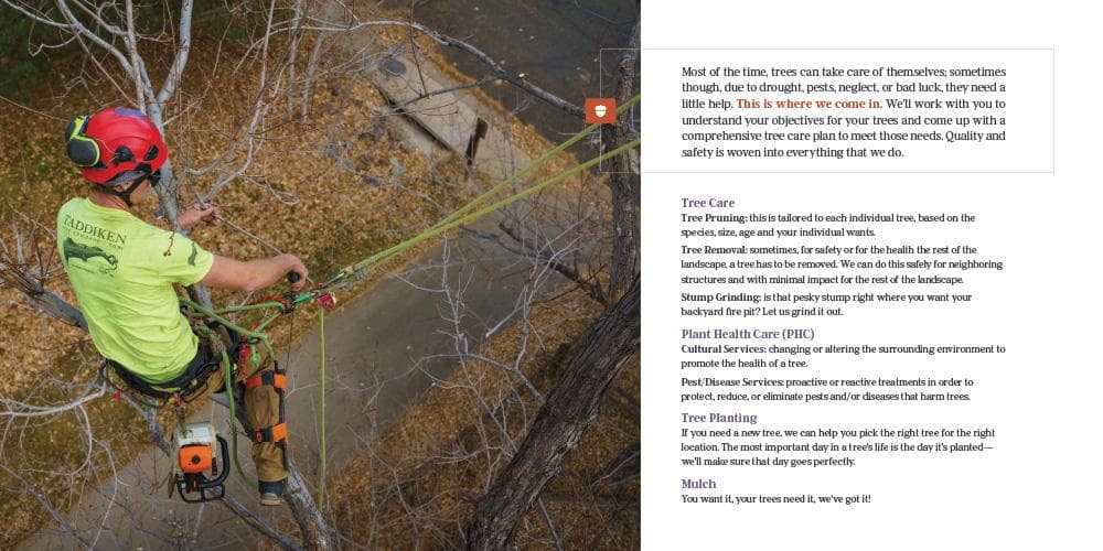
I also wanted a 'thinner' column of text. Desktop usage is fading anyway and it's easier to read a more narrow column. Why bother designing for a 32" monitor anymore? It's easier to just keep it tight.

Brochure (page one)Brochure (page two)Brochure (page three)

Goal

A printed brochure (8 inches square) that the arborists could leave behind. Taddiken was really about the community, it was nice to produce this because I knew they generally had good people working there who were leaders in their neighborhoods doing well by employees and customers.


Soapbox

One of the best things about having a monthly contract with companies is the opportunity to do all the work (not just web, ux, product, etc.). I like wearing lots of hats. Plus, being a print designer as well as ux/product/whatever designer makes me far better at all the rest.

HomeHome

Goal

Refresh the website with something newer and more modern. There are lots of other marketing goals attached to that such as selling schwag and tying the contact form into a custom CRM, but really the main part was just a visual refresh.


Approach

  • With the home page, I wanted it to be organic and ever-changing. As part of it, the hero changes with the seasons. We have more ideas in store (such as seasonal tweaks to the nav).
  • Taddiken was also the first client where I officially used some of my photographs as a major part of the design process. The "spring" hero was shot at the park where I start my runs on my little island. I have a few more shots sprinkled throughout the site as well.
  • Obviously, the major focus is the contact button. It gets a fair bit of use, enough so that we're going to have to change the way it's wired on the back-end before we start paying additional money for the form capture.
  • All the photos of tree service are from local photographers. The one on the home page is classic as it not only shows the Flatirons (instantly recognizable to any locals), but also the state champion sycamore at one of the universities in Boulder.
  • All the client testimonials link to the actual testimonial at it's source (usually Google).
  • Recent blog posts also show up on the home page, once again, keeping it fresh.

Tech

  • The site is built on Gridsome with Contentful as a CMS
Logos

Goal

I was hoping to convince them to redo their logo. Sometimes I don't win—this was one of those times and they stuck with the old logo.

But I still like my approach.


Approach

  • The top logo (the main logo) incorporates the founder's signature. It's unique and I like it. It's also a fun Easter egg if people find out later.
  • The next three are seasonal variations. I never finished winter.
  • The last is what the logo might have turned into given time. I like the 'tree' aspect of that T and striped it like the local aspen trees.
  • I just love some of these letters and combinations. I also love those contrasty serif fonts. I think it's a nice blend of masculine and feminine.
about

Goal

Keep moving forward.


Approach

  • The other thing I love about Taddiken is that know there is no "done" with a website, we're continuing to make forward progress on a very long list of enhancements.
yard signyard signyard sign

Goal

Yard signs for residences and business where the crews work.


Approach

  • Your business copy can be fun. Taddiken gets that.
  • Let's pretend that I update my portfolio more than once every three years and assume more will be coming soon. Taddiken is an ongoing project and developing as I write this.